Recreating Lenore Tawney's 1964 Drawing 'Reflected Ray'
Jul 2019 · 835 words · 4 minutes read
Background
My wife and I moved to London in early 2017. One of the first things we did when we got here was visit the Tate Museum. While there, I walked by a subtle trio of drawings by an artist I had never heard of. I took a photo of my favorite and kept walking.
It is about two years later (July 2019) and we now have a five month old daughter. As soon as she was born we immediately started to back up every photo we ever took of anything. It was during this process that I stumbled upon my original image:
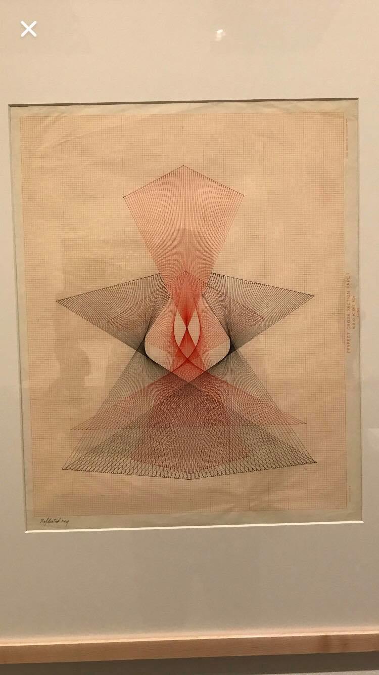
The artist is Lenore Tawney, an American who worked in the mid-20th century. She is actually more well-known for her work with “fiber” and yarn but she has what I think is a beautiful collection of Ink Drawings.
The one I captured at the Tate that day in 2017 is called “Reflected Ray”. I loved the geometry and simplicity of this work. The medium of simple ink on 1960’s industrial draft paper I thought was also really beautiful and cool.
Using ggpomological
I ran into ggpomological a while ago and I thought it looked awesome. Unfortunately, I didn’t see much application in the work environment where I spend 99% of my R time. When I was looking at the Lenore Tawney artwork again today though I thought it would be a fun application of the paint_pomological() feature which uses magick to give a ggplot output the look of hand-drawing on paper. In this demo I’ll use this feature to make a pretty cool rendering of Lenore Tawney’s Reflected Ray in ggplot.
R Code
We’ll use ggplot2 for plotting, and ggpomological for the theme and paper effect.
require( 'ggplot2')
require( 'ggpomological')
In order to generate the dataset, I visually picked out the x and y coordinates for the main nodes, categorized the lines into some rough “groups” based on their color and what component of the entire illustration I thought they comprised, and then counted the number of lines between the nodes of that smaller component. I then evenly spaced lines in between the starting and ending nodes in order to generate the rough x and y coordinates for the entire component.
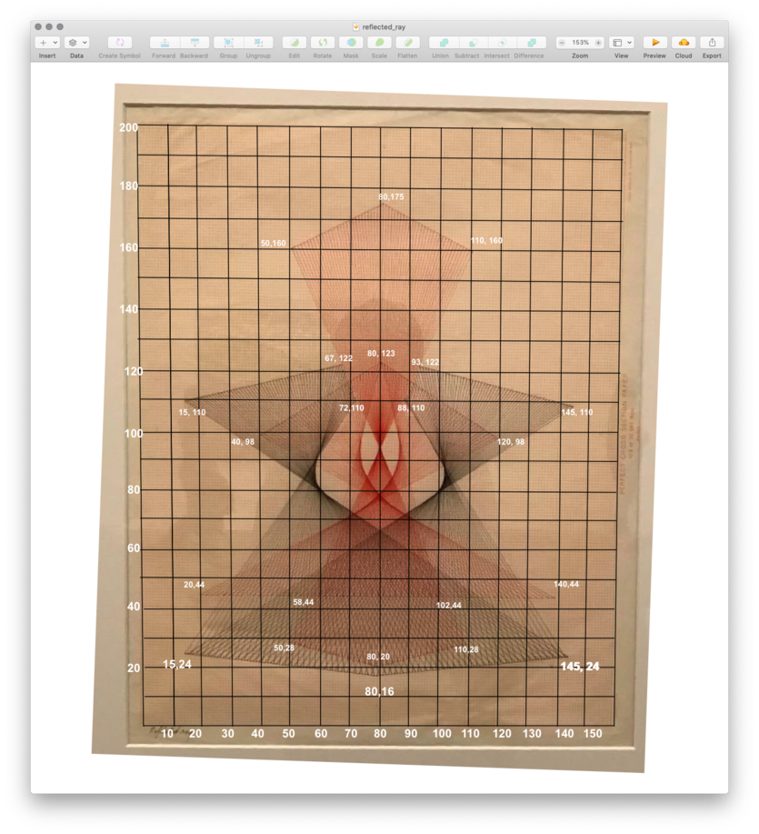
I uploaded the file with the resulting data to my repo for this site:
d.in <- readr::read_csv('https://raw.githubusercontent.com/Twoy519/peakmaximum/master/data_assets/reflected_ray_data.csv')

head(d.in)
## # A tibble: 6 x 6
## line_group color x1 y1 x2 y2
## <chr> <chr> <dbl> <dbl> <dbl> <dbl>
## 1 bottom_right_boundary_leftwing dark 15 24 80 16
## 2 bottom_left_boundary_left_wing dark 80 16 145 24
## 3 top_boundary_left_wing dark 15 110 67 122
## 4 bottom_to_left_wing dark 15 24 72 110
## 5 bottom_to_left_wing dark 17 23.8 71.6 111.
## 6 bottom_to_left_wing dark 19 23.5 71.2 112.I originally thought I was going to have to do something crazy with geom_line but a quick check for a better way revealed geom_segment to be a one-liner. Each line has a color as well as the starting point {x1, y1} and the ending point {x2, y2}. We can feed these coordinates into geom_segment’s x1, xend, y1 and yend aesthetics.
Plot
The plot below follows this high-level logic:
- We can use
geom_segmentto pass the coordinates and the colors - The original artwork is basically a 160 wide by 200 tall grid, with the major gridlines breaking on the 10’s. We pass
expand=c(0,0)to thescale_*_continuouspieces in order to bring the axes right up to the edge of the plot area panel. - I downloaded the font ‘Homemade Apple’ which looked good enough to pass for the title of the piece in the bottom left. This is passed by default into
theme_pomological_fancy() - I turn off the axis labels, format the major and minor grid components, and stick the caption in the bottom left.
- I set the colors
plt <- ggplot(d.in) +
  geom_segment(aes(x=x1, y=y1, xend=x2, yend=y2, color=color), alpha = 0.2) +
  scale_x_continuous(
    limits = c(0,160)
    , breaks = seq(0,160, by = 10)
    , minor_breaks = seq(0,160, by = 1)
    , expand = c(0,0)
  ) +
  scale_y_continuous(
    limits = c(0,200)
    , breaks = seq(0,200, by = 10)
    , minor_breaks = seq(0,200, by = 1)
    , expand = c(0,0)
    , position='right'
  ) +
  labs(
    caption='Reflected ray'
  ) +
  theme_pomological_fancy() +
  theme(
    legend.position = 'none'
    , axis.text = element_blank()
    , axis.title = element_blank()
    , panel.grid.major = element_line(color = '#E4AA84', size = 0.5, linetype=1)
    , panel.grid.minor = element_line(color = '#E4AA84', size = 0.25, linetype=1)
    , panel.border = element_rect(color = '#E4AA84')
    , plot.caption = element_text(hjust = 0, color = 'dark gray')
  ) +
  scale_color_manual(values=c('black','#8F0F01'))
Our plot looks like this with the default ggplot output
plt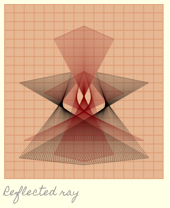
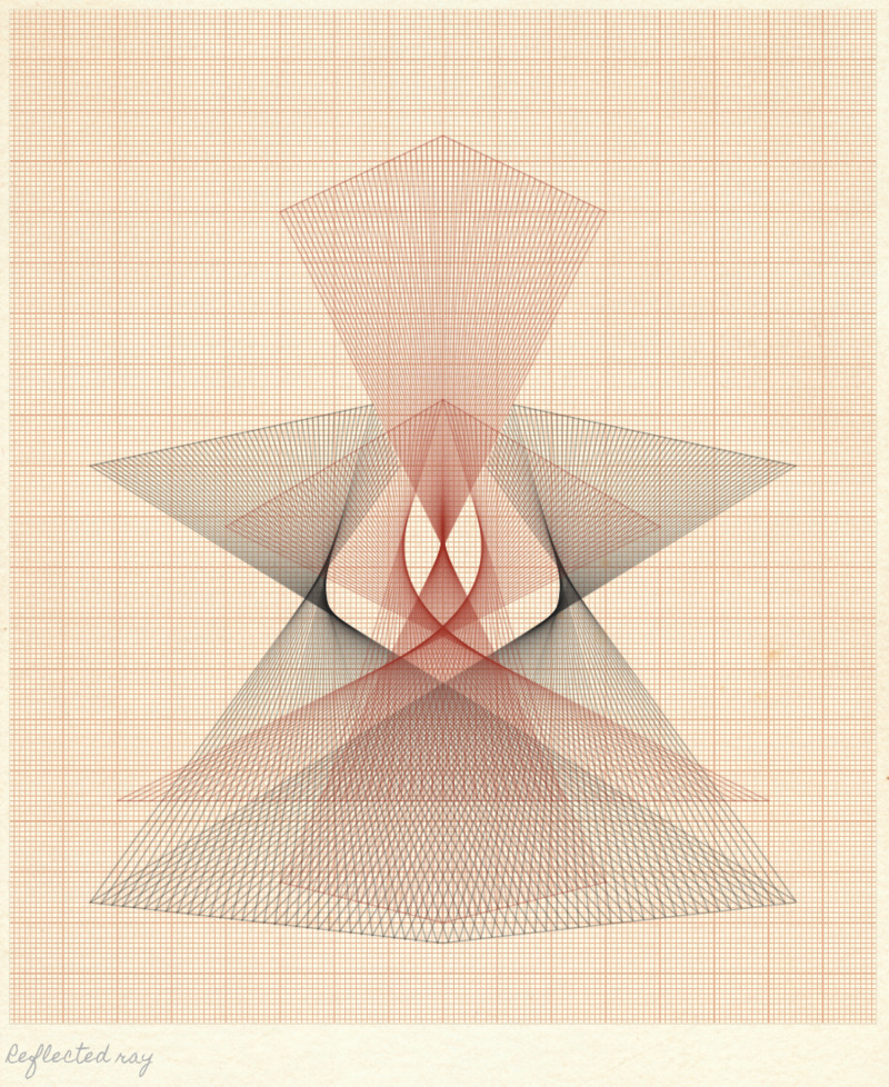
The piece that puts the icing on the cake here in terms of making the font look more like handwriting and the background look more like paper is set with paint_pomological.
paint_pomological(
  plt
  , res = 110
  , width = 180 * 5
  , height = 220 * 5
)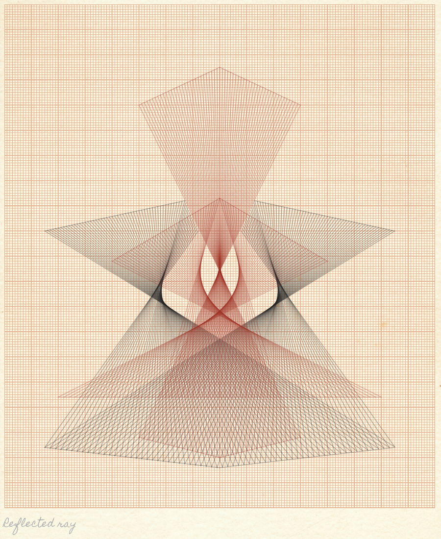
🔥 And there ya go! 🔥
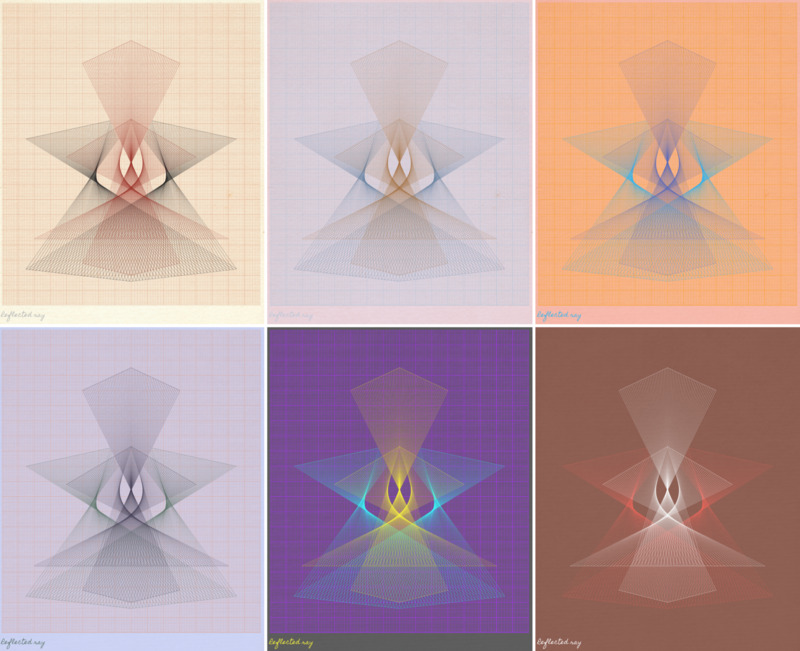
And then just for fun we’ll Andy Warhol it up
