Visualizing Prophet Forecasts (And Errors) with purrr, and gganimate
Dec 2018 · 2186 words · 11 minutes read
Credit Where Credit is Due
The idea and methods of using purrr with Prophet here were not my own. I copied this methodology from a coworker who was kind enough to share this approach below which leverages map() functions to more cleanly structure our input data and apply the forecast function over it many times.
Part 1: Background
What Am I Doing?
Facebook has developed an open-source forecasting library for Python and R called Prophet authored by Sean J. Taylor.
Long story short is that this is a simple API that allows you to feed it a two-column timeseries, and it will generate a forecast for you. The dataset required is simple, just a date column, and then a column for pretty much any number you want. Common examples are ‘price of this thing’, or ‘revenue of my business’.
They recently upgraded to version 0.4
We released Prophet 0.4 today! Thanks to all the wonderful contributors ❤️
— Sean J. Taylor (@seanjtaylor) December 21, 2018
Prophet can now automatically generate lists of holidays for over a dozen countries. Just in time for the holidays 🕎🎄😜
Install: https://t.co/x1BFZSPqP9
Built-in holiday docs: https://t.co/QCJUpx4I21 pic.twitter.com/382u6bTqsL
Inspired by another writeup from Len Keifer, I figured an animated time-series would be a good use-case for showing how Prophet’s forecasts change through time as new data is added. The below writeup is the process I went through to generate the gif at the top of this post.
Part 2: Fetching A Good Time-Series Example Dataset
My earlier post on time-series changes used wikipedia pageviews of various footballers to try and demonstrate how to adjust time-series analysis for magnitude differences in values. We could try to use that same dataset to feed into Prophet and have it spit out some forecasts as well, however we probably need pages with a bit more volume than that. Fortunately the pageviews packages has the project_pageviews function that will give us aggregated pageviews for the whole ‘https://en.wikipedia.org’ site.
library( 'pageviews')
library( 'dplyr')
library( 'magrittr')

trend_data <-
  project_pageviews(
    project = "en.wikipedia",
    end = as.Date("2019-01-01"),
    user_type="user"
  )
library( 'ggplot2')
library( 'scales')
library( 'ggthemr')
ggthemr::ggthemr(palette='flat', type='outer')
ggplot(
trend_data
, aes(x=date, y = views / 1e6)
) +
geom_line() +
scale_y_continuous(labels = scales::comma) +
labs(
title = 'en.wikipedia.org Views (MM) by Day'
, subtitle = glue::glue('From {min(trend_data$date)} to {max(trend_data$date)}')
, x = element_blank()
, y = element_blank()
) +
theme(
legend.position = 'top'
, legend.title = element_blank()
)
Part 3: Forecasting With Prophet
Prophet is relatively straightforward by default. You simply pass it a dataframe with a date and a number, and it gives you a forecast. Using this doc page as a guide, let’s simply feed it aggregate pageview data from our query and see what it spits out.
library( 'prophet')

# prophet requires the `date` field you pass is named 'ds' in accordance with the commonly used term within Facebook (and maybe other places) and that the numeric variable is called 'y'.

input <- trend_data %>%
  rename(
    ds = date,
    y = views
  ) %>%
  select(ds,y)

str(input)
## 'data.frame': 1183 obs. of 2 variables:
## $ ds: POSIXct, format: "2015-10-01" "2015-10-02" ...
## $ y : num 2.39e+08 2.34e+08 2.21e+08 2.44e+08 2.60e+08 ...Step 1: use prophet() on your input dataframe to generate a model
m <- prophet(input)## Initial log joint probability = -4.32426
## Optimization terminated normally:
## Convergence detected: relative gradient magnitude is below toleranceStep 2: Generate a new dataframe with dates from the future that you will be forecasting
future <- make_future_dataframe(m, periods = 365)
tail(future)
## ds
## 1543 2019-12-21
## 1544 2019-12-22
## 1545 2019-12-23
## 1546 2019-12-24
## 1547 2019-12-25
## 1548 2019-12-26Step 3: Use Prophet’s predict() function to…predict.
predict() spits out fancy names like “yhat” because science. “yhat” just means the predicted value. Predict also provides some confidence intervals in the form of yhat_upper and yhat_lower fields.
forecast <- predict(m, future)

tail(forecast[c('ds', 'yhat', 'yhat_lower', 'yhat_upper')])
## ds yhat yhat_lower yhat_upper
## 1543 2019-12-21 215831216 186602926 247437319
## 1544 2019-12-22 234981104 204770394 264235377
## 1545 2019-12-23 247539297 216850786 280548852
## 1546 2019-12-24 240706024 209992206 272511944
## 1547 2019-12-25 237249932 208611900 268305270
## 1548 2019-12-26 233935735 202597517 264565582Step 4: Visualize the results
ggthemr::ggthemr_reset()
plot(m, forecast)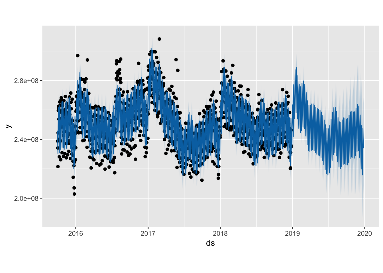
You can look at seasonal components out of the box as well:
prophet_plot_components(m, forecast)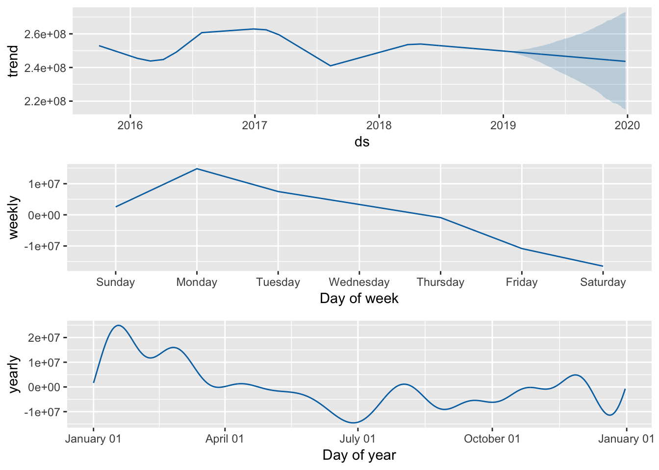
But! None of this is really why we’re here. Let’s use the power of purrr and gganimate to run a whole bunch of forecasts and check how Prophet performs.
#Part 4: Using furrr
Our end goal is to generate multiple forecasts and compare the results. The problem with this is that Prophet forecasts take some time to generate. Not a long time, but enough time that if you want to run more than a handful, you will have time go get a hot or cold beverage of your choice and maybe a lunch and a dinner by time time they finish. To quote the furrr documentation, furr “Appl(ies) Mapping Functions in Parallel using Futures”. That means stuff may go faster if we use furrr.
Step 1: Generating Backtest Data
We want to run a forecast every day starting in 2017 (when we have a good history of data from 2015 and 2016) up to today (Dec 21, 2018) and then compare the results to what actually happened.
To prep the data, we’ll need to generate a dataframe that has the entire history of the pageviews data up to the date that we want to run a forecast for EACH DAY that we want to forecast.
input$ds <- as.Date(input$ds)

datelist <- seq(from=as.Date('2017-01-01'), to=as.Date(max(input$ds)), by = 'day') %>%
  data.frame() %>%
  rename(forecast_date='.') %>%
  mutate(forecast_date = as.factor(forecast_date))

historical_dates <- input %>%
  mutate(ds=as.factor(ds)) %>%
  select(ds) %>%
  unique()

full_dates <- expand.grid(
    datelist$forecast_date,
    historical_dates$ds
  ) %>%
  rename(
    forecast_date = Var1,
    ds = Var2
  ) %>%
  mutate(
    forecast_date = as.Date(forecast_date),
    ds = as.Date(ds)
    )

full_dates <- full_dates[full_dates$forecast_date >= full_dates$ds,]

full_dates <- full_dates %>%
  left_join(input, by='ds')
So we have a full history of pageviews up to Jan 1 2017:
full_dates %>% filter(forecast_date=='2017-01-01') %>% tail()## forecast_date ds y
## 454 2017-01-01 2016-12-27 274080180
## 455 2017-01-01 2016-12-28 274697955
## 456 2017-01-01 2016-12-29 281605235
## 457 2017-01-01 2016-12-30 258525316
## 458 2017-01-01 2016-12-31 240635052
## 459 2017-01-01 2017-01-01 257199090And a full history up to every other date after Jan 1 2017. So on Dec 21 2018, we have every day up to that as well.
full_dates %>% filter(forecast_date=='2018-12-21') %>% tail()## forecast_date ds y
## 1173 2018-12-21 2018-12-16 244933688
## 1174 2018-12-21 2018-12-17 258270188
## 1175 2018-12-21 2018-12-18 247192256
## 1176 2018-12-21 2018-12-19 240800343
## 1177 2018-12-21 2018-12-20 231354940
## 1178 2018-12-21 2018-12-21 220120335Here is where we start to do the nesting magic.
We’re going to nest the history of pageviews into a single cell for each day we want to run a forecast:
full_dates %<>%
    group_by( forecast_date) %>%
    tidyr::nest()

names(full_dates) <- c('forecast_date','model_data')

head(full_dates)
## # A tibble: 6 x 2
## forecast_date model_data
## <date> <list>
## 1 2017-01-01 <tibble [459 × 2]>
## 2 2017-01-02 <tibble [460 × 2]>
## 3 2017-01-03 <tibble [461 × 2]>
## 4 2017-01-04 <tibble [462 × 2]>
## 5 2017-01-05 <tibble [463 × 2]>
## 6 2017-01-06 <tibble [464 × 2]>Then we declare a function to call Prophet.
prophet_call <- function(df) {
    prophet(df)
}
Then we use furrr::future_map() to run a forecast model for each day in our backtest. The ‘possibly’ call allows us to do avoid error failures.
library('future')
library('purrr')
library('furrr')

future::plan(multiprocess)
full_dates %<>%
  mutate(
    model = furrr::future_map(
      model_data,
      possibly( prophet_call, NA)),
      err = purrr::map_lgl( model, is.logical)
    )
This gives us a forecast model for every single day in the ‘model’ field.
head(full_dates)## # A tibble: 6 x 4
## forecast_date model_data model err
## <date> <list> <list> <lgl>
## 1 2017-01-01 <tibble [459 × 2]> <S3: prophet> FALSE
## 2 2017-01-02 <tibble [460 × 2]> <S3: prophet> FALSE
## 3 2017-01-03 <tibble [461 × 2]> <S3: prophet> FALSE
## 4 2017-01-04 <tibble [462 × 2]> <S3: prophet> FALSE
## 5 2017-01-05 <tibble [463 × 2]> <S3: prophet> FALSE
## 6 2017-01-06 <tibble [464 × 2]> <S3: prophet> FALSEWe can now use that model to predict on. This part will take some time, it is running about two years of forecasts. One forecast per day.
# Create empty future dataframe and predict
plan(multiprocess)
full_dates <- full_dates %>%
  dplyr::filter(err==F) %>%
  dplyr::mutate(
    future = purrr::map(model, ~make_future_dataframe(., periods = 365))
    , future = furrr::future_map2(model, future, predict)
  )
That will run for a while and then output the forecast prediction values to the column we called future.
In this example, we ran a different forecast for a whole bunch of days in the past for backtesting purposes, but you can do this type of thing on the same day and for a bunch of countries for example.
Part 5: Plotting The Results with gganimate
Step 1: View the output
Let’s unnest the data and look at an example date of Jan. 1 2017
forecast_df <- full_dates %>%
    filter(forecast_date == '2017-01-01') %>%
    select(forecast_date, future) %>%
    tidyr::unnest() %>%
    select(forecast_date, ds, yhat, yhat_upper, yhat_lower) %>%
    mutate(ds=as.Date(ds)) %>%
    left_join(input, by='ds')

ggthemr::ggthemr(palette='flat', type = 'outer', layout='clean')

ggplot(
  forecast_df %>%
    filter(ds >= '2017-01-01', ds <= '2017-03-31')
  , aes(
    x = ds
  )
) +
  geom_line(
    data = forecast_df %>% filter(ds >= '2016-12-01', ds <= '2017-01-01')
    , aes( y = y/1e6, color = 'Input', linetype="Input")
    ) +
  geom_line(
    data = forecast_df %>% filter(ds >= '2017-01-01', ds <= '2017-03-31')
    , aes( y = yhat/1e6, color = 'Forecast', linetype='Forecast')
  ) +
  geom_line(
    data = forecast_df %>% filter(ds >= '2017-01-01', ds <= '2017-03-31')
    , aes( y = y/1e6, color = 'Actual', linetype="Actual")
    ) +
  scale_color_manual("", values=c("Input"="black", "Forecast"="tomato", "Actual" = "blue"), guide = guide_legend(reverse=TRUE)) +
  scale_linetype_manual("", values=c("Input"=1, "Forecast"=2, "Actual" = 3), guide = guide_legend(reverse=TRUE)) +
  labs(title="Wikipedia Daily Pageviews Forecast as of Jan. 1 2017", subtitle='Pageviews in Millions',x = element_blank(), y=element_blank()) +
  theme(legend.position='top')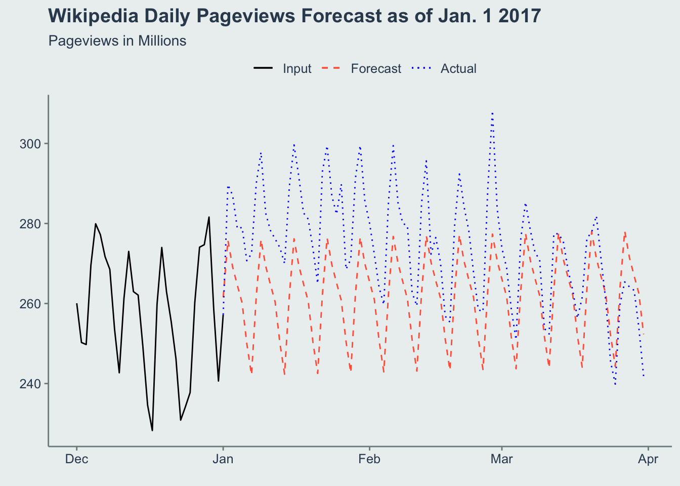
We also have a separate forecast that was generated using data up to January 1 2018.
forecast_df <- full_dates %>%
    filter(forecast_date == '2018-01-01') %>%
    select(forecast_date, future) %>%
    tidyr::unnest() %>%
    select(forecast_date, ds, yhat, yhat_upper, yhat_lower) %>%
    mutate(ds=as.Date(ds)) %>%
    left_join(input, by='ds')

ggthemr::ggthemr(palette='flat', type = 'outer', layout='clean')

ggplot(
  forecast_df %>%
    filter(ds >= '2018-01-01', ds <= '2018-03-31')
  , aes(
    x = ds
  )
) +
  geom_line(
    data = forecast_df %>% filter(ds >= '2017-12-01', ds <= '2018-01-01')
    , aes( y = y/1e6, color = 'Input', linetype="Input")
    ) +
  geom_line(
    data = forecast_df %>% filter(ds >= '2018-01-01', ds <= '2018-03-31')
    , aes( y = yhat/1e6, color = 'Forecast', linetype='Forecast')
  ) +
  geom_line(
    data = forecast_df %>% filter(ds >= '2018-01-01', ds <= '2018-03-31')
    , aes( y = y/1e6, color = 'Actual', linetype="Actual")
    ) +
  scale_color_manual("", values=c("Input"="black", "Forecast"="tomato", "Actual" = "blue"), guide = guide_legend(reverse=TRUE)) +
  scale_linetype_manual("", values=c("Input"=1, "Forecast"=2, "Actual" = 3), guide = guide_legend(reverse=TRUE)) +
  labs(title="Wikipedia Daily Pageviews Forecast as of Jan. 1 **2018**", subtitle='Pageviews in Millions',x = element_blank(), y=element_blank()) +
  theme(legend.position='top')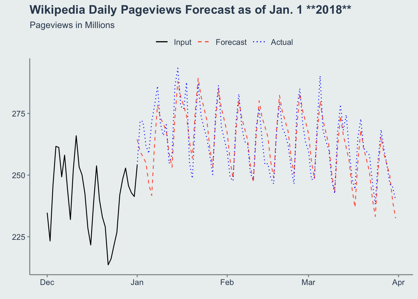
You can see this appears to be more accurate. This would support the case that Prophet performs better now that it had more data to train on (a full year more!).
Step 2: Calculate the Error Rates
So let’s calculate the error rates of our forecasts by day. To keep things simple let’s just do the 30-day error rates and define our error as the MAPE (Mean Absolute Percent Error). This is just a fancy acronym to say “divide the predicted value by what actually happened and then state it in absolute terms”. So e.g. if you’re off by 5% high or low every day on average in the 30-days following your forecast, your 30-day MAPE is 5%.
forecast_df <- full_dates %>%
    select(forecast_date, future) %>%
    tidyr::unnest() %>%
    select(forecast_date, ds, yhat) %>%
    mutate(ds=as.Date(ds)) %>%
    left_join(input, by='ds')

error_df <- forecast_df %>%
  group_by( forecast_date) %>%
  arrange( ds) %>%
  mutate(
    in_error_window = between( ds - forecast_date, 1, 30)
    , error = abs( ifelse( in_error_window, yhat/y-1, NA))
  ) %>%
  group_by( forecast_date, in_error_window) %>%
  mutate(
    mape_30d = mean(error)
  ) %>%
  ungroup() %>%
  filter(in_error_window) %>%
  group_by(forecast_date) %>%
  summarise(mape_30d = max(mape_30d))

ggplot(
  error_df
  , aes(x=forecast_date, y = mape_30d)
) +
  geom_line() +
  labs(title="Prophet's 30d MAPE on en.wikipedia.org Pageviews") +
  scale_y_continuous(labels = scales::percent_format(accuracy=1)) +
  scale_x_date(date_breaks = '1 months', date_labels = '%b %y') +
  theme(axis.text.x = element_text(angle=45, hjust=1), axis.title=element_blank(), panel.grid.major = element_line(color='grey',linetype=2))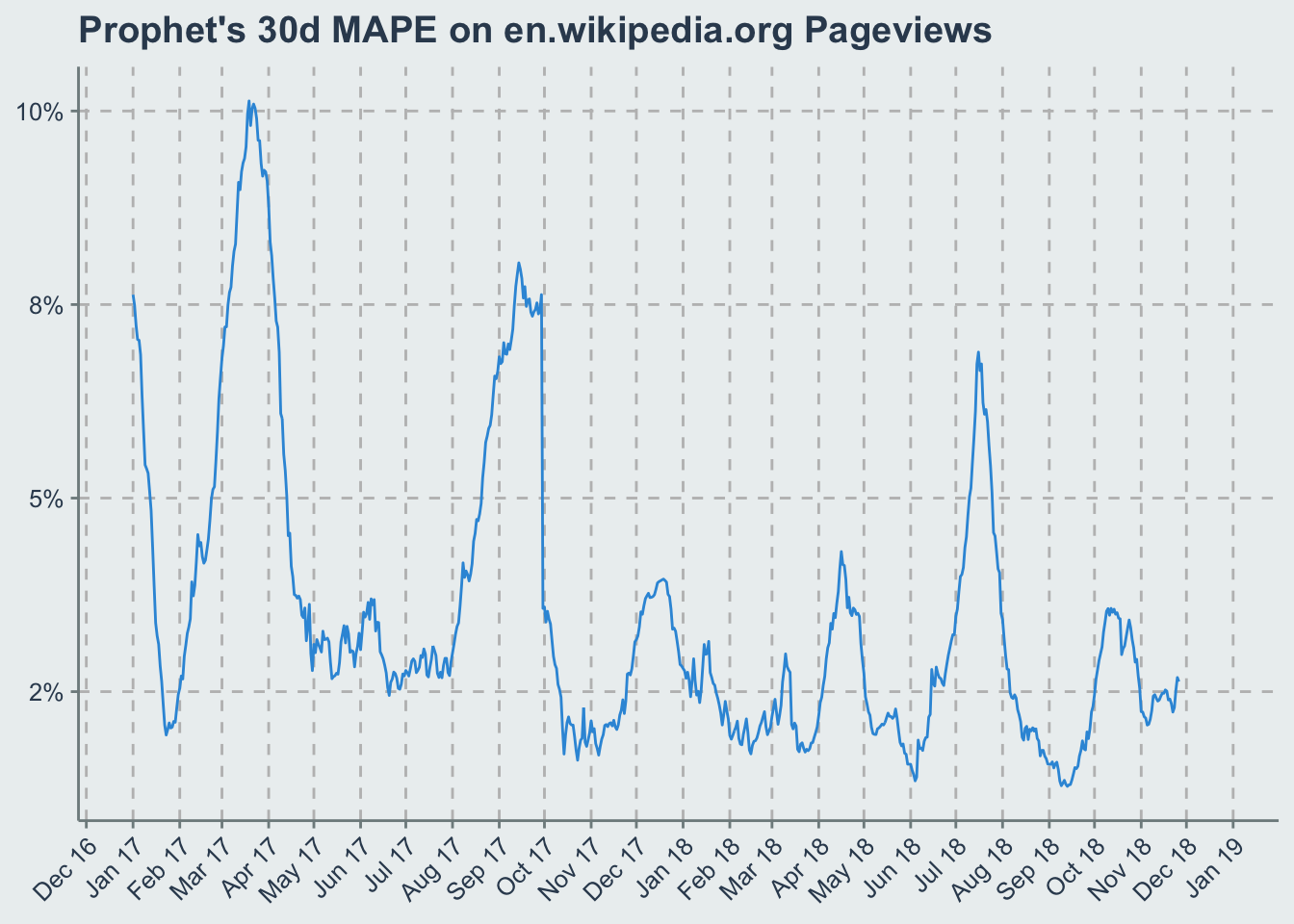
Step 3: Make A Pretty gif Of This With gganimate
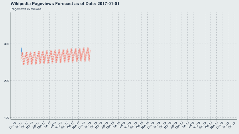
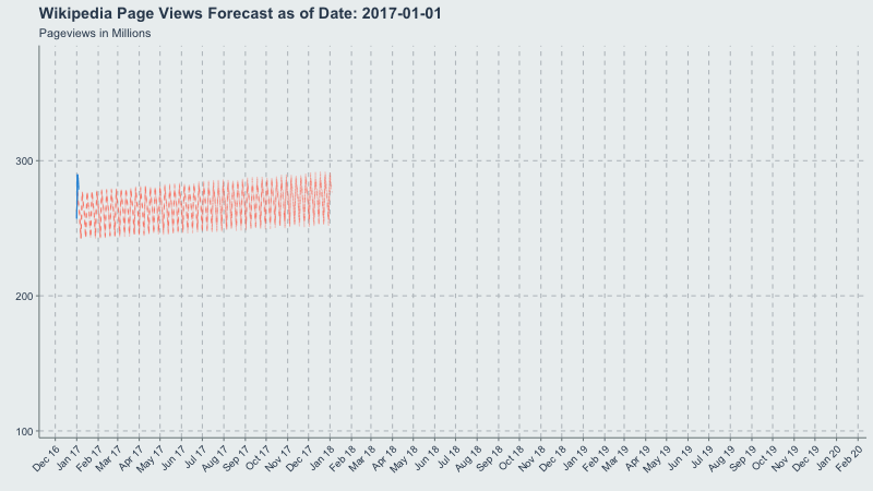
Now let’s make a gif of our forecast through time, partitioned by the forecast_date field!
This long-term view is great because you can see where the yearly.seasonality=TRUE kicks in around October 2017.
library('gganimate')

forecast_df <- forecast_df %>% group_by(forecast_date)

ggthemr::ggthemr(palette='flat', type = 'outer')

forecast_plot <- ggplot(
  forecast_df %>% filter(
    ds >= '2017-01-01',
    ds <= forecast_date + 365,
    forecast_date >= '2017-01-01'
    )
  , aes(
    x = ds
  )
) +
  geom_line(
    aes( y = yhat/1e6, group=forecast_date)
    , color = 'tomato'
    , linetype = 2
    , alpha=0.3
  ) +
  geom_line(
    data = forecast_df %>% filter(ds >= '2017-01-01', ds <= forecast_date, forecast_date >= '2017-01-01')
    , aes( y = y/1e6, group=forecast_date)
    ) +
  scale_x_date(date_breaks = '1 month', date_labels='%b %y') +
  theme(axis.text.x=element_text(angle=45, hjust = 1)) +
  transition_time(forecast_date) +
  ease_aes('linear') +
  labs(
    title = 'Wikipedia Pageviews Forecast as of Date: {frame_time}'
    , subtitle='Pageviews in Millions'
    , x = element_blank()
    , y = element_blank()
    )

gganimate::animate(forecast_plot, width = 800, height = 450)