Plot Grouped Indexed Time-Series Changes
Dec 2017 · 832 words · 4 minutes read

COPY / PASTE HERE:
mutate( index = value / value[1] - 1 )
One thing I do at my job all. the. time is index time-series together in order to compare relative changes in a given time window. The problem statement is usually when I’m comparing the price changes of two assets with vastly different prices. So trying to plot something moving from $1MM to $1.1MM on the same plot as something moving from $10 to $11.
There are other methods of doing this. Most notably for me is Len Kiefer’s sweet animation moving the index point through time. Making the gifs is a bit much for 99% of real-world use-cases though so I’ll skip that.
I wrote this post though mainly as a note to myself so I won’t have to re-google it until I’ve fully commited it to memory.
For this example, we need a dataset which is a time-series with at least two grouping factors.
Let’s get wikipedia page visits for a few footballers using the pageviews package
library( pageviews)

trend_data <-
  article_pageviews(
    project = "en.wikipedia",
    article = c(
      'Luis_Suárez'
      , 'Lionel_Messi'
      , 'Neymar'
      , 'Christian_Pulisic'
      , 'Harry_Kane'
      , 'Mohamed_Salah'
      , 'Philippe_Coutinho'
      , 'Roberto_Firmino'
      , 'Jordan_Henderson'
    ),
    start = "2016010100",
    end="2017010100"
  )

library( magrittr)

trend_data %<>%
  mutate(
    date = as.Date( date)
    , article = as.factor( article)
  ) %>%
  select(date, article, views)

library( dplyr)
library( scales)

glimpse( trend_data)
## Observations: 3,281
## Variables: 3
## $ date <date> 2016-01-01, 2016-01-02, 2016-01-03, 2016-01-04, 2016-01…
## $ article <fct> Luis_Suárez, Luis_Suárez, Luis_Suárez, Luis_Suárez, Luis…
## $ views <dbl> 6809, 8033, 6251, 6378, 6427, 6277, 6580, 6349, 7734, 69…trend_data %>%
group_by( article) %>%
summarise( pageviews = sum(views, na.rm=T)) %>%
arrange(-pageviews) %>%
mutate( pageviews = scales::comma(pageviews))## # A tibble: 9 x 2
## article pageviews
## <fct> <chr>
## 1 Lionel_Messi 12,323,125
## 2 Neymar 4,214,055
## 3 Luis_Suárez 2,564,810
## 4 Harry_Kane 1,709,017
## 5 Christian_Pulisic 1,295,802
## 6 Philippe_Coutinho 1,001,555
## 7 Roberto_Firmino 869,566
## 8 Mohamed_Salah 507,699
## 9 Jordan_Henderson 500,496So we see that we have a time series with grouping variables that are magnitudes different in scale due to the varying popularities of the footballer. The problem this poses is that looking at a time-series trend is hard to parse for changes.
library( ggplot2)

ggplot(
  trend_data
  ,aes(
    x = date
    , y = views
    , color = article
  )
) +
  geom_line() +
  theme_bw() +
  scale_color_brewer(palette='Set1') +
  labs(title = 'Wikipedia Pageviews of Footballers since Jan 2016') +
  theme(axis.title = element_blank()) +
  scale_y_continuous(labels=scales::comma)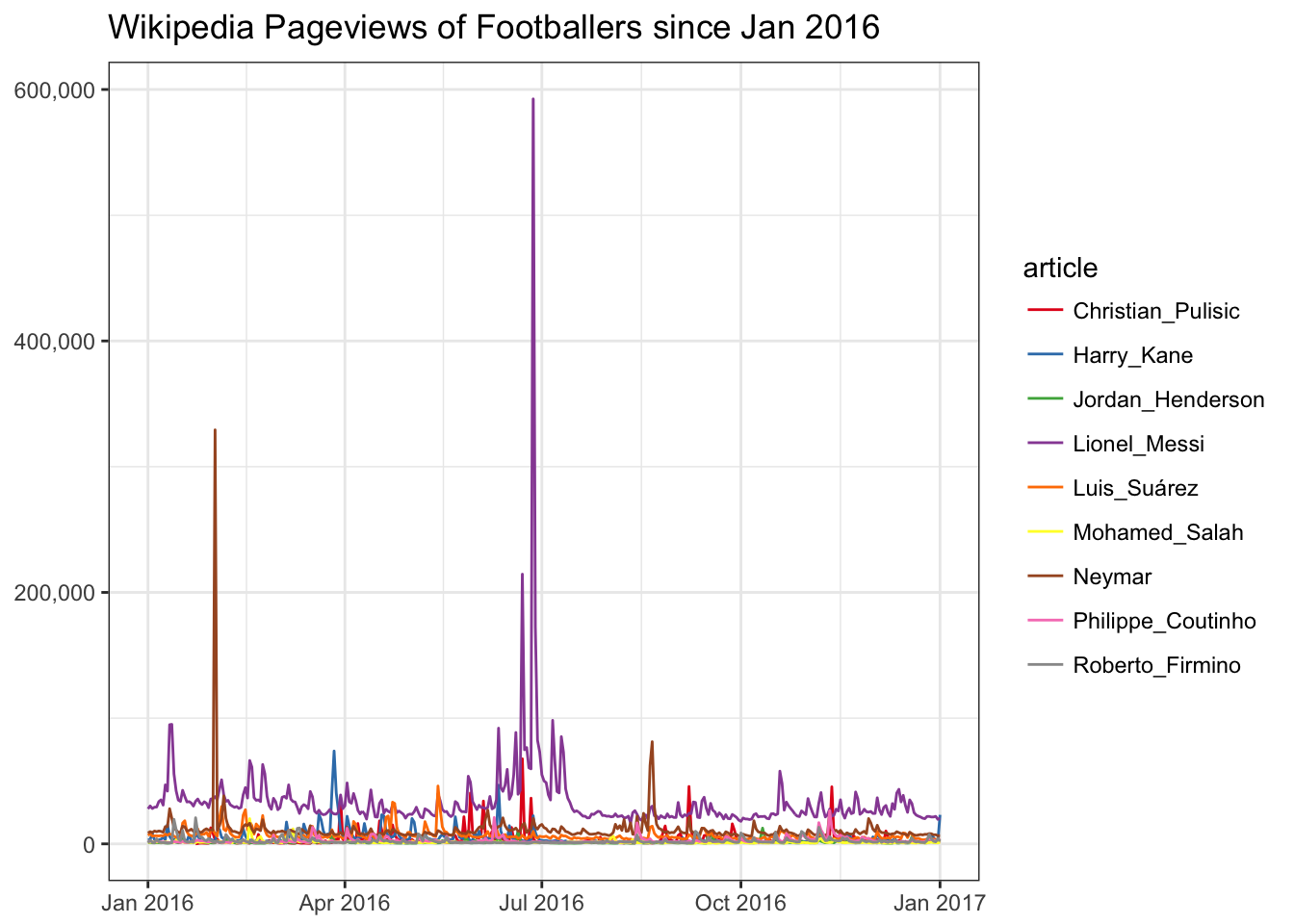
There are a couple methods of dealing with this.
- Change the scale on the y-axis to a log-transformed scale.
- Normalize the values by showing percent change instead of absolute values.
ggplot(
  trend_data
  ,aes(
    x = date
    , y = views
    , color = article
  )
) +
  geom_line() +
  theme_bw() +
  scale_color_brewer(palette='Set1') +
  labs(
    title = 'Wikipedia Pageviews of Footballers since Jan 2016'
    , subtitle = 'Log-scaled y-axis'
  ) +
  theme(axis.title = element_blank()) +
  scale_y_log10(labels=scales::comma, breaks = c(1e2,1e3,1e4,1e5,1e6))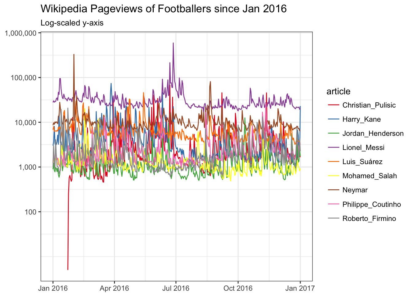
This doesn’t really help that much. Let’s pick a focused time period, and show a percentage change. I’m interested in seeing if Jordan Henderson got an uptick in September 2016 after his stunner:
ggplot(
  trend_data %>%
    filter( date >= '2016-09-01', date < '2016-10-01')
  ,aes(
    x = date
    , y = views
    , color = article
  )
) +
  geom_line() +
  theme_bw() +
  scale_color_brewer(palette='Set1') +
  labs(
    title = 'Wikipedia Pageviews of Footballers since Jan 2016'
    , subtitle = 'Log-scaled y-axis'
  ) +
  theme(axis.title = element_blank(), panel.background = element_rect(fill='#E0E0E0')) +
  scale_y_log10(labels=scales::comma, breaks = c(1e2,1e3,1e4,1e5,1e6))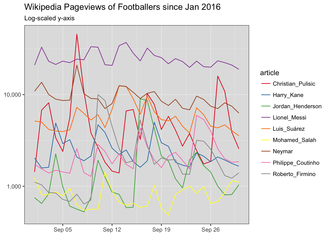
Sure did. This is OK, but Jordan’s line doesn’t really stand out. Here’s where the indexing comes in. Let’s show percent change instead of absolute values.
ggplot(
  trend_data %>%
    filter( date >= '2016-09-01', date < '2016-10-01') %>%
    group_by(article) %>%
    arrange(date) %>%
    mutate(index = views / views[1] - 1)
  ,aes(
    x = date
    , y = index
    , color = article
  )
) +
  geom_line() +
  theme_bw() +
  scale_color_brewer(palette='Set1') +
  labs(
    title = 'Wikipedia Pageviews of Footballers since Jan 2016'
    , subtitle = 'Log-scaled y-axis'
  ) +
  theme(axis.title = element_blank(), panel.background = element_rect(fill='#E0E0E0')) +
  scale_y_continuous(labels=scales::percent)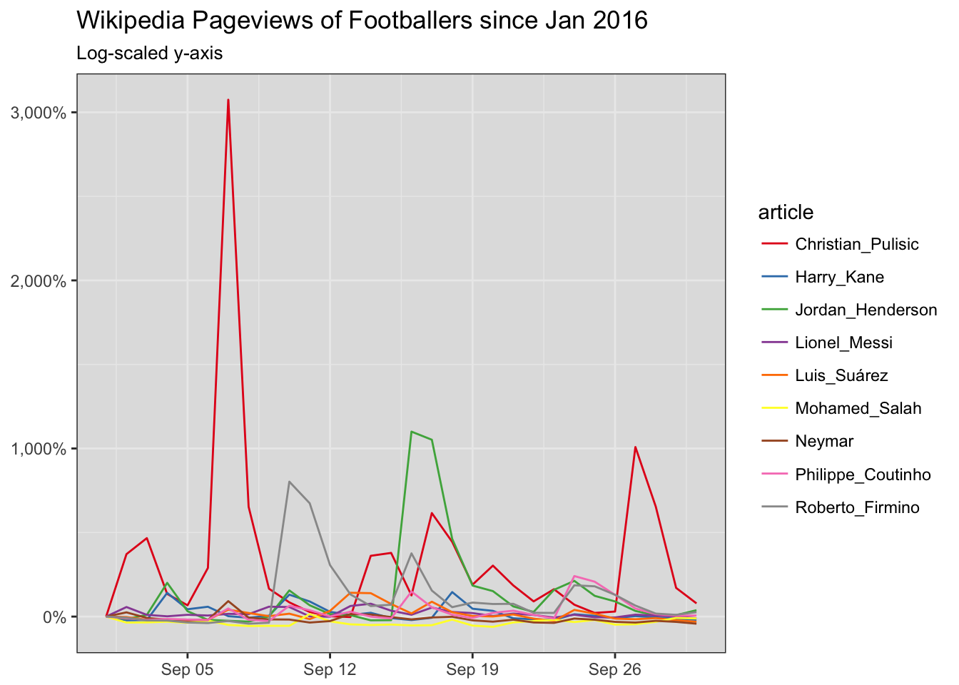
We can see Jordan Henderson’s wonderstrike sending him skyrocketing up. Stupid Cristian Pulisic ruins it a bit.
Let’s smooth these curves out with a 3-day average using zoo’s rollmean function.
library( zoo)

ggplot(
  trend_data %>%
    filter( date >= '2016-09-01', date < '2016-10-01') %>%
    group_by(article) %>%
    arrange(date) %>%
    mutate(
      index = views / views[1] - 1
      , index_mean_3d = rollmean(index, k = 3, align='right', fill = NA)
      )
  ,aes(
    x = date
    , y = index_mean_3d
    , color = article
  )
) +
  geom_line() +
  theme_bw() +
  scale_color_brewer(palette='Set1') +
  labs(
    title = 'Wikipedia Pageviews of Footballers since Jan 2016'
    , subtitle = 'Log-scaled y-axis'
  ) +
  theme(axis.title = element_blank(), panel.background = element_rect(fill='#E0E0E0')) +
  scale_y_continuous( labels=scales::percent)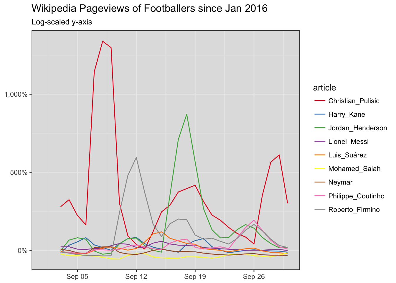
After this we can implement some simple z-scores (fancy word for normalizing) to get a feel for who’s trending. That’ll be another post though.